New Branding, New Tagline, New Logo? Hartford Has It, with Burst of Consistency
/
If pictures are worth a thousand words, then the recently revealed revised branding and accompanying taglines and logos for some of the Capitol region’s leading organizations not only speak volumes, but to so in a remarkably consistent way, right down to the color palette.
Within the past month, the MetroHartford Alliance, the Region’s economic development leader and the Hartford’s Chamber of Commerce, and the Hartford Foundation for Public Giving, unveiled new logos and updated branding designed to signal the region’s new-found energy.
They follow by less than a year the new logo and tagline for Riverfront Recapture – the first logo redesign in the organization’s 33-year history – which came along with a new website and related materials. The Hartford Public Library also launched in new logo and slogan within the past few years.
The MetroHartford Alliance logo, conceptualized by Avon-based Mintz + Hoke, an Alliance Strategic Partner, is representative of Hartford’s city skyline and is richly colored to reflect the vibrancy, diverse talent and economic vitality of the Region.
The new visual identity for the Hartford Foundation for Public Giving- the state’s largest community foundation serving the 29-town region in Greater Hartford - seeks to build on the strength and credibility of the foundation, while conveying a more dynamic, future-oriented image for the organization, officials explained.
The new logo features a colorful and visually striking “Nexus,” and the new tagline “Together for good” has a multi-tiered meaning that emphasizes the collabor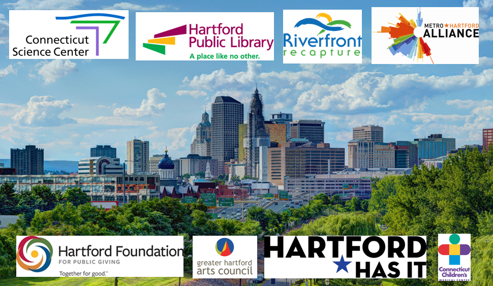 ative way the Hartford Foundation works and the permanence and stability that the 89-year old organization provides to the community.
Visually, one can't help but notice the reds, blues, greens, golds and purple that populate many of the logos, in various combinations, accompanying swirls, circles, stars and lines. Not exactly a family of logos, but certainly not dissimilar either. Had the city set out to bring consistency and vibrancy together in an updated, cohesive look, they couldn't have done much better.
The Hartford Foundation retained the services of one of the state’s leading branding consultants, Adams & Knight to engage in a collaborative effort between Hartford Foundation board members, staff and representatives from the community to develop a new logo and tagline for the organization. This work occurred over several months and involved community research, external peer reviews, employee activities, and an exploration of a variety of logo and tagline options.
Riverfront Recapture’s new logo, adopted in May 2013, “more accurately conveys the "essence of our Riverfront – a special place, shaped by nature, where a magnificent greenway meets the Connecticut River,” officials said. The logo, designed by The Pita Group of Rocky Hill, uses abstract shapes to suggest the river and the greenway coming together as vibrant meeting places for outdoor recreation, entertainment, and cultural activities. The logo change was part of a larger branding and messaging project that also produced a new tagline – “Different by Nature” – to describe the Riverfront parks in Hartford and East Hartford. “It’s what sets our Riverfront apart from other urban waterfronts. And we want to celebrate that difference.”
Riverfront Recapture, a nonprofit organization, has taken the lead in overseeing design and construction of the Riverfront parks since 1981 and now manages the parks for the City of Hartford and the Town of East Hartford, which own the land where the parks are located. Riverfront Recapture is responsible for all of the programming in the parks, including free festivals and concerts as well as sporting events such as rowing classes and a regatta, and dragon boat races.
The Hartford Public Library’s new brand identity – launched in 2011 - defines it as a traditionally-rooted yet progressive organization that offers tools and inspiration for growth and development.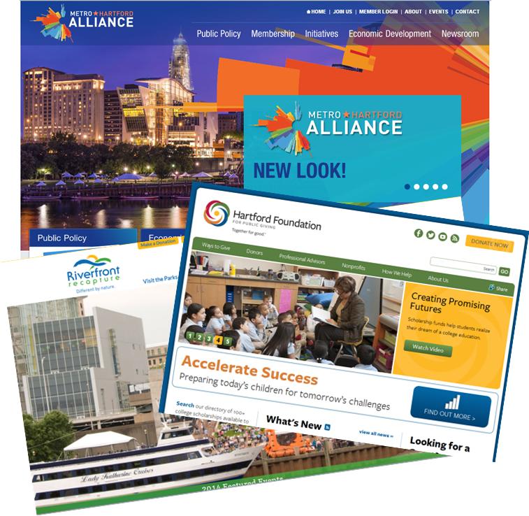
The staircase imagery in the logo and the A Place Like No Other tagline represent a pathway to discovery, a window to knowledge and understanding of the world. The brand identity embodies the library’s unique mix of enriching resources that are helping both its customers and the Greater Hartford region define a prosperous social, cultural, financial and educational future.
The Greater Hartford Arts Council logo, launched in 2007, was designed by Pita Communications. It followed the Connecticut Children’s Medical Center and Connecticut Science Center logo designs, which may have unknowingly begun the movement to the colorful, dynamic logos a decade ago, setting the foundation for the current wave of rebranding.
The City of Hartford, in its rebranding, had initially sought design concepts from a number of out-of-state firms, but ultimately decided not to proceed with any of the finalists in the selection process. Instead, just over a year ago, the city began using the “Hartford Has It” slogan on tourism and promotional materials. The overarching concept behind the slogan permits the array of new logos and branding initiatives to fit nicely together, visually and thematically, to promote the city, the region, its leading organizations and residents.


